Browse documentation
On this page
Brand
Assets and guidelines for representing Cirth in articles, talks, integrations, and anywhere else the project is named.
The part that survives a retheme.
Cirth's identity is not the copper. The accent is the first token any adopter replaces, and a framework whose character lives entirely in one hue has no character left the moment it is adopted. What stays is below: proportions, strokes and target sizes that hold in every preset, every scheme and every build. Compare the default specimen with the plain one — same six measurements, different pigment.
- Container corner
9px·--cirth-card-border-radius- Control corner
6px·--cirth-border-radius- Resting edge
1px, all four sides, every button variant- Target floor
44pxcontrols ·40pxin a nav- Card contract
- Tinted header band ·
12/20px· padded body - Spacing unit
4pxscale ·16pxdefault step
The pairing is the recognisable part. A container is one radius step softer
than the controls inside it, so a card reads as a sheet holding buttons
rather than as a big button. Every resting edge is the same single hairline
— a filled button, an outline button, a field, a card and a popover all draw
the same 1px on all four sides, and none of them fakes relief on one edge.
Interactive targets sit on a 44px floor (WCAG 2.5.5), except inside a
<nav>, which opts down to a 40px band while staying above the 24px WCAG
2.5.8 minimum.
Those are the marks to preserve when Cirth is restyled. Replacing
--cirth-primary is expected and supported; flattening the radius pair to a
single value, thickening one edge of a control, or dropping the target floor
takes the interface out of the system.
The mark #
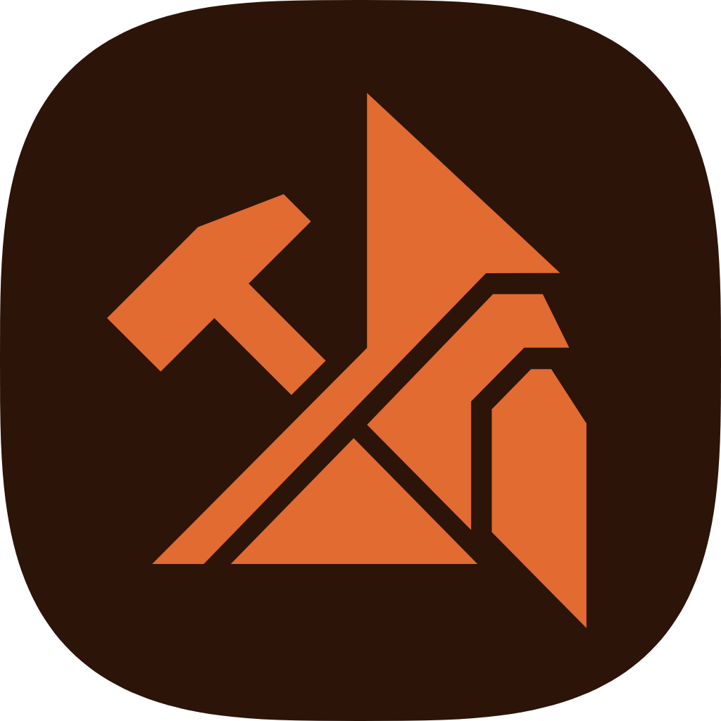
The Cirth mark is a rune-form monogram: angular strokes that read as a carved "C". It references the project's namesake, the Cirth runic alphabet used by Tolkien's Dwarves, designed for carving into hard surfaces so every letter is reduced to the strokes the material allows. The same reduction — keep only what the medium requires — is the engineering constraint the framework itself is built around: keep only what the medium requires, and watch the size of what is left. See About Cirth for how the budgets work, and why they are a guard rather than a promise.
One mark, three levels of fidelity.


- Base unit
8px- Micro unit
4px- Primary joint
45°- Clearspace
0.5 × mark width- Signal hue
44°- Minimum size
16px optical
Cirth is not affiliated with, endorsed by, or associated with the Tolkien estate, the Tolkien Society, Amazon's Middle-earth adaptations, or any other rights holder. The name is a reference to a real-world writing system, not a claim of license or partnership.



Each variant above is downloadable as SVG (preferred) or PNG. The full set
lives in
docs/public/,
including the two combinations this grid does not show — the mono mark on
its own background tile, light and dark, for square containers that have to
stay one colour.
Use the brand (copper) mark wherever color is available, matching the variant to the background. Use mono in one color contexts such as print, badges, embossing. The icon variants sit on their own background tile; use them where the mark needs to fill a square: favicons, social avatars, bookmark icons. Not for inline use next to text.
Operational rules #
Use the full mark above 24px and switch to the optical small-size mark for favicon-scale contexts. The optical variant preserves the incised “C”, removes the detached origin accent, and fills more of its view box. It is an experimental responsive asset; the original SVG files remain unchanged.
The 45° joint is a structural device for diagram junctions, section terminals, and large composition crops. Do not apply it to every card, button, or input. Keep clearspace equal to half the visible mark width.
Incorrect use #
Do not stretch, rotate, outline, add a glow, put the mark on low-contrast surfaces, repeat it as wallpaper, or pair it with fantasy imagery. Do not use the small-size variant above 24px, where its reduced detail becomes unnecessarily blunt.
Color #
The brand color is copper, and in an interface it has exactly two jobs: action and current position. A primary button, a focus ring and a link in running prose are actions. The rail beside the page you are on, the edge on an active in-page nav item and a selected control are position. Header navbars are quieter chrome: they use ink and weight rather than an accent edge. Nothing else in a Cirth interface is copper.
Editorial typography is the one place outside those two, and it is a deliberate exception rather than a leak: a word or phrase set in the accent inside a heading, the way this site's home page sets semantic HTML. It is a single named class, applied by hand, in prose — not a component state.
It used to do five. Navigation links carried the accent at rest, which meant a menu of eight entries was eight brand-coloured words next to one button that also wanted the colour, and the accent stopped meaning "act on this" and started meaning "this is a Cirth screen". Navigation now takes the ink of whatever it sits in and the accent marks only where you are — so the one thing copper still says, it says alone.
The light theme's base surface is a mineral paper rather than white, and the card sheet carries the same temperature: the page is not neutral, but the warmth is a surface property, not a wash of the accent. In dark the base is a graphite carrying the same stone tint as the neutral scale. Neither scheme paints the brand hue across backgrounds.
The mark's hue, 44° in oklch, is the exact hue the framework's entire copper scale is generated from; the logo sits brighter and more saturated than the UI tokens because it is an identity color, not a text color. The scale holds the accent at 70% of its own gamut ceiling so it can cover whole surfaces without shouting; the mark, which covers a monogram, is free to sit at 85%.
| Role | Value |
|---|---|
| Mark, light backgrounds | #BD5928 (oklch(58% 0.143 44deg)) |
| Mark, dark backgrounds | #E16B31 (oklch(66% 0.163 44deg)) |
| UI primary (light theme) | oklch(52.7% 0.107 44deg), from $copper-550 |
| UI primary (dark theme) | oklch(65.7% 0.134 44deg), from $copper-400 |
The dark UI primary is one ladder step deeper than a mirror of the light one would be. Copper's gamut ceiling climbs steeply past 65% lightness, so the mirroring step comes out an orange; a step down keeps it reading as metal and still clears AA on every surface in the scheme.
In interfaces, always use the --cirth-primary* tokens rather than the
logo hexes: the tokens are variants verified for WCAG. See
Colors for the full system.
The lockup #
The horizontal lockup is the mark with the name beside it: "Cirth" in the sans voice, bold, with the mark sized to the cap height and sitting on the same baseline. Use it where the name has to travel with the mark and there is room for both — a third-party README, a talk slide, a conference badge, a social post.







A one-colour lockup is available as
wordmark_mono.svg
for print, badges and embossing. It paints with currentColor, so
inline it to give it your own ink; loaded through <img> it
falls back to black, the same as the mono mark.

The name is live text, not outlines. The lockup carries <text> in the
system sans stack the framework itself ships, which is the whole of the
typographic claim: there is no font to install, and nothing to license. The
cost is that the word's width moves a little between platforms — SF Pro sets
it narrowest, Helvetica and Arial about 2.5% wider — so the box reserves
room for the widest face in the stack and a narrower one leaves a little air
on the right. That is the intended behaviour, not a mis-export.
Which asset, at which size #
| Context | Asset | Why |
|---|---|---|
| Name and mark together, 128px wide and up | Lockup | Below 128px the mark inside it drops under its own 24px floor |
| Square container: favicon, avatar, app tile | Icon tile | The mark fills the square; the lockup cannot |
| Inline beside text, 24px and up | Full mark | Five-part mark at medium fidelity |
| 16–23px | Optical small mark | Fewer parts, tighter box |
The lockup does not replace the mark at small sizes. Shrinking it until the name is legible makes the mark illegible first; at that point the mark alone is the correct asset and the name belongs in the text next to it.
Typography #
Sans-serif is the primary typographic voice for product surfaces, headings,
and UI chrome, and it is the voice the lockup is set in. Monospace is
reserved for code, size metrics, and proof points (13.6 KB,
--cirth-primary), and for the site's own chrome, where the name appears as
a navigational label rather than as the wordmark. Serif remains available as
a primitive token for an author to opt into, but is not part of Cirth's
product voice. There is no custom font to install: the brand uses the same
system stacks the framework ships, on purpose.
Write the name as Cirth (capitalized, never uppercase); the npm scope
is @cirthcss/cirth.
Using the mark in technical contexts #
The mark is built to survive small, high-contrast, low-color placements: READMEs, npm listings, CI badges, terminal output headers, favicons. Use the mono variant wherever a single flat color is preferable to copper (badges, print, embossing, low-color terminals), and the icon tile wherever the mark needs to fill a square container. Don't pair the mark with fantasy-styled illustration, parchment or stone textures, or medieval typography — the mark itself carries the reference to the name; the surrounding presentation should stay contemporary and technical.
Voice #
Cirth's writing is technical but accessible, precise, and evidence-led: assertive about what is verified, transparent about trade-offs, and never ideological. Prefer claim → mechanism → proof — state what the framework does, explain how, then point at something checkable (a script, a number, a source file).
Favor words like native, runtime, tokens, scope, integrate, verify, ship, baseline, size budget, and browser primitives. Avoid purity, timeless, philosophy, framework dialect, and repeated carving metaphors outside the name's origin story — and avoid unverifiable claims such as "nothing to break," "fully accessible," or "always delivered in one round trip."
Example headlines:
- "Production-ready UI from semantic HTML."
- "One stylesheet. Runtime tokens. No JavaScript runtime."
- "A size budget on every bundle, checked on every build."
Example one-line descriptions:
- "Cirth turns native HTML elements into accessible, themeable interfaces, with zero shipped JavaScript."
- "An HTML-native CSS framework with a runtime design token system and a monitored gzipped size budget."
Usage agreement #
The Cirth code is released under the Apache License 2.0; the name and logo are brand assets with their own terms:
- Naming projects. You may use the Cirth name as part of a noncommercial open source project's name, for example "cirth-react" or "cirth-starter", as long as it's clear the project is built for Cirth, not by Cirth. Using the name in a commercial product or service requires prior written permission.
- Using the logo. The mark may be used in articles, talks, tutorials, and documentation that reference Cirth, with attribution. It may not be used as (or inside) the logo of another project, product, or company, whether open source or commercial.
- Merchandise. Using the Cirth name or logo on merchandise (shirts, stickers, and similar) requires explicit written consent.
- No implied endorsement. Neither the name nor the mark may be used in a way that suggests Cirth endorses, certifies, or maintains an external product.
For permissions, open an issue on GitHub.
Keeping the mark intact #
When you do use the mark:
- keep clearspace around it of at least half its width;
- use the responsive small-size asset from 16–23px;
- pick the brand or mono variant that keeps contrast on your background;
- don't recolor, outline, rotate, add effects, or redraw the strokes, and don't set the wordmark in another typeface — use the lockup rather than re-typesetting the name.